
WilsonAmplifiers.com is an e-commerce website and an authorized reseller of Wilson Electronics cell phone signal booster systems. The company offers a complete line of products that amplify the weak signal and improve cellular reception in commercial buildings, homes, and vehicles. The company is based in Houston, Texas.
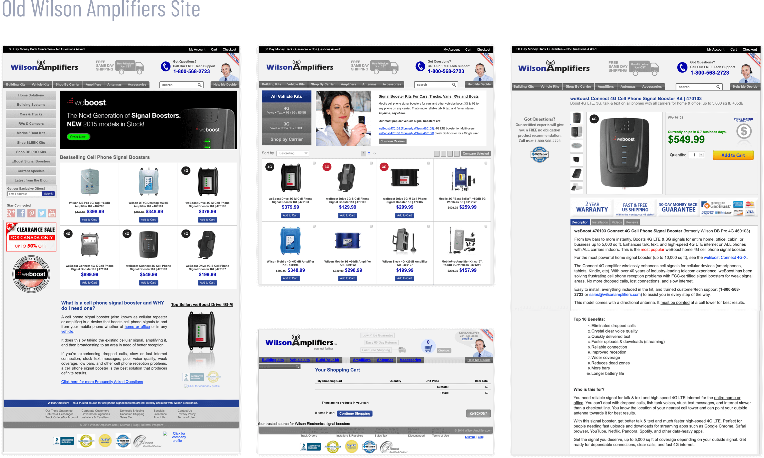
Since 2011 the company managed to build a loyal customer base due to excellent call center and customer support service. However, the e-commerce website had only an average of 2.0% conversion rate, which was lower than desired. The old site looked dated, cluttered, and inconsistent. The information architecture was convoluted as new information and product categories were added over time without any logical change to the site navigation. Nearly 40% of all web traffic was coming from mobile devices, but the mobile site showed a high bounce rate due to poor UX.
- Dated look, cluttered interface, and inconsistent branding
- Non-responsive site and poor mobile experience
- Complicated checkout process
- Conversion rate under 2.0% and 45-60% bounce rate
- Slow loading times: 20+ sec mobile / 12+ sec desktop
- Convoluted site architecture and navigation
I was hired as a User Experience & Brand Experience Director/Individual Contributor to help the company redesign the e-commerce site and improve the overall brand and customer experience.
I worked remotely with a distributed team composed of a marketing director, a copywriter, and several front-end and back-end developers.
For the site redesign, I proposed using a Discover-Define-Design framework with continuous testing, validation, and iterations.
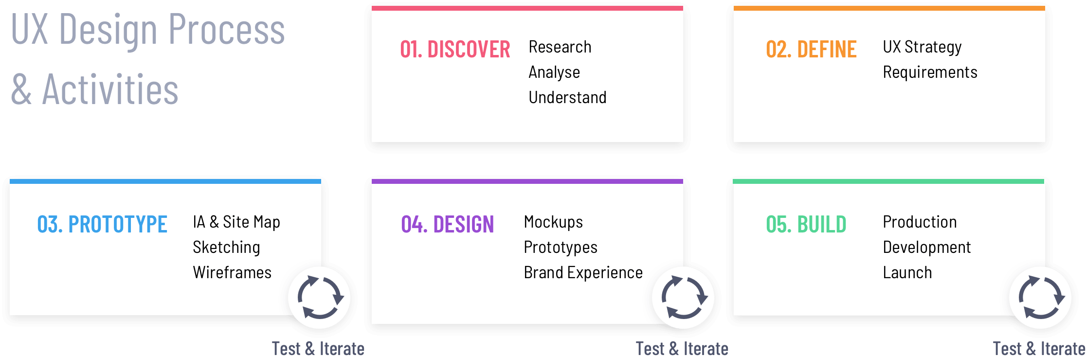
In the Discover phase, my objective was to define the project requirements from multiple viewpoints: old site evaluation, analytics review, competitors analysis, stakeholder interview, and user research.
I conducted a heuristic evaluation of the old Wilson Amplifiers site to identify critical problem areas. I looked at Google Analytics Pageview and Traffic Analysis to see where the visitors were coming from, their entry and exit points, how much time people spent on key pages, conversion rates, and page bounce rates.
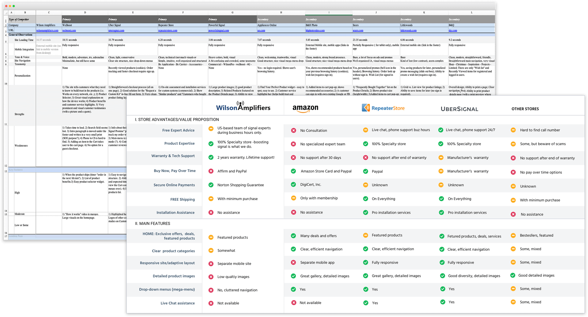
I looked at several successful competitor sites to get insights on how they motivate and educate their customers.
A series of kick-off meetings with the stakeholders helped me to understand the business objectives and the company’s values, such as excellent customer service, reliable products, and competitive pricing. One of the key goals was to minimize the number of calls to the call center. Customers should be able to easily find and choose the right product based on required cell phone signal coverage capacity and effortlessly complete the purchase online.
I interviewed the Call Center employees to gain insights into who were the target customers, what were typical contacts between customers and the business, and the most common questions that the customers asked before they made the decision to buy.
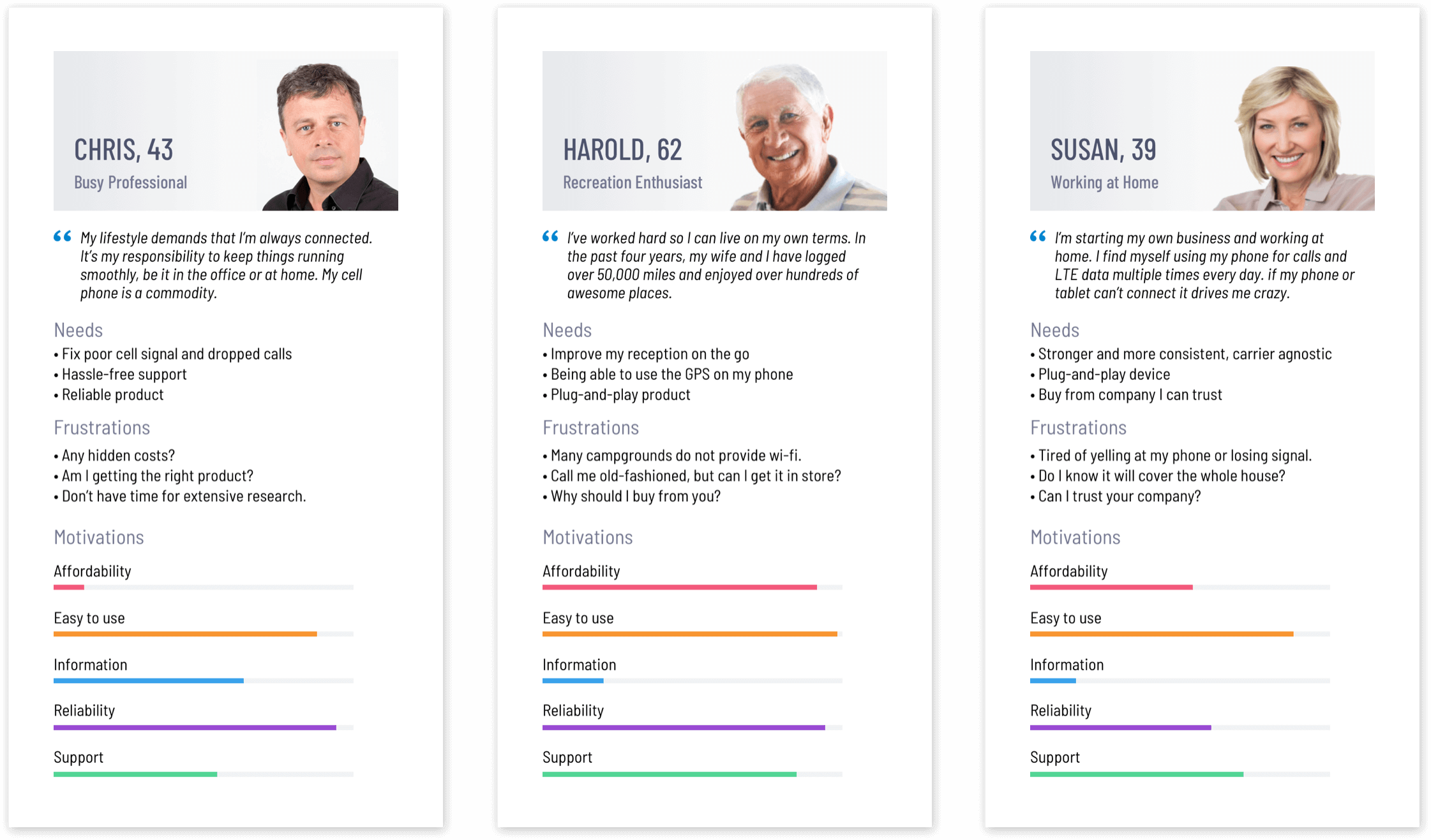
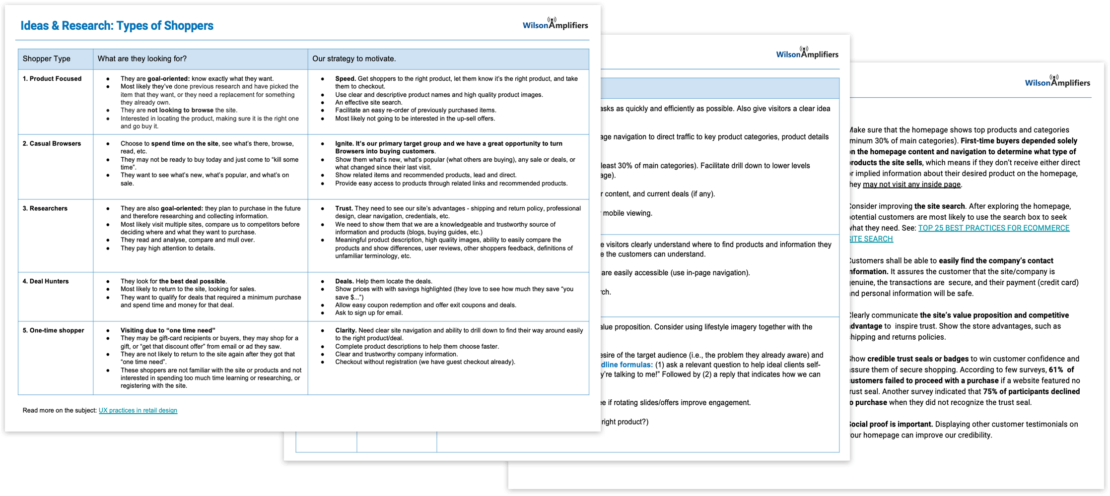
I identified several customer groups and created primary personas that encompassed the needs of each target audience. This helped me to visually communicate the customers’ motivations, frustrations, desires, and concerns to the stakeholders.
The discovery and research activities helped me gather ideas and get clarity on business objectives and user needs. Next, I focused on creating a unified set of project requirements. The team and I prioritized the features based on the effort required and importance to both the target audience and the business.
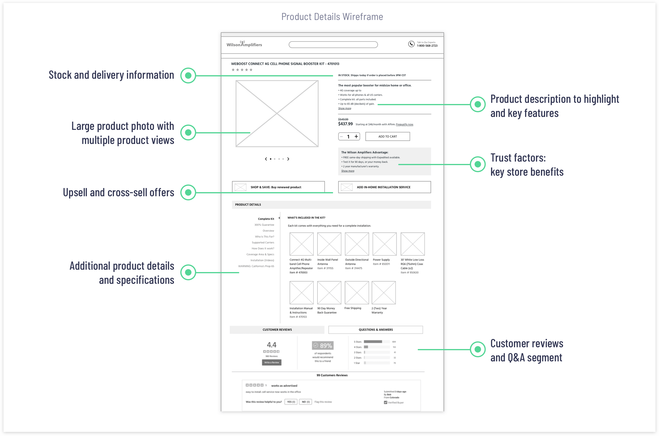
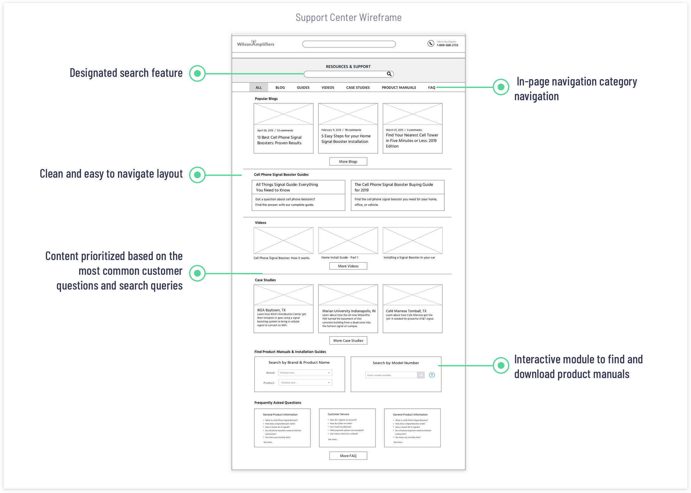
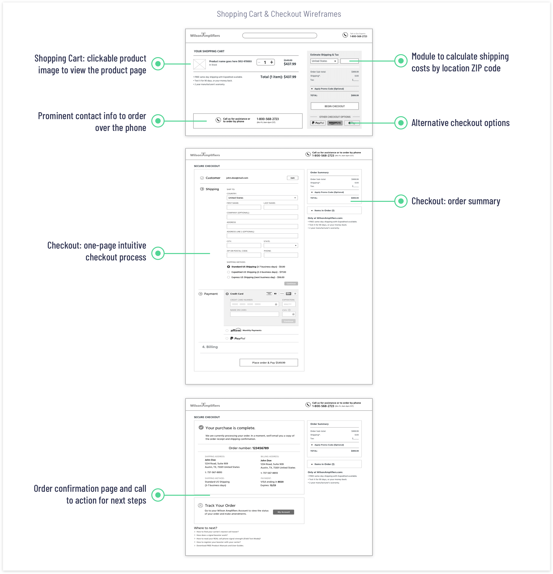
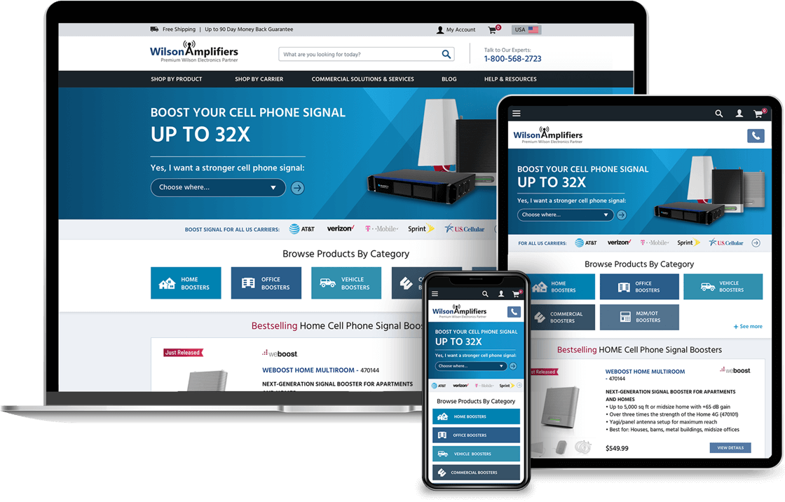
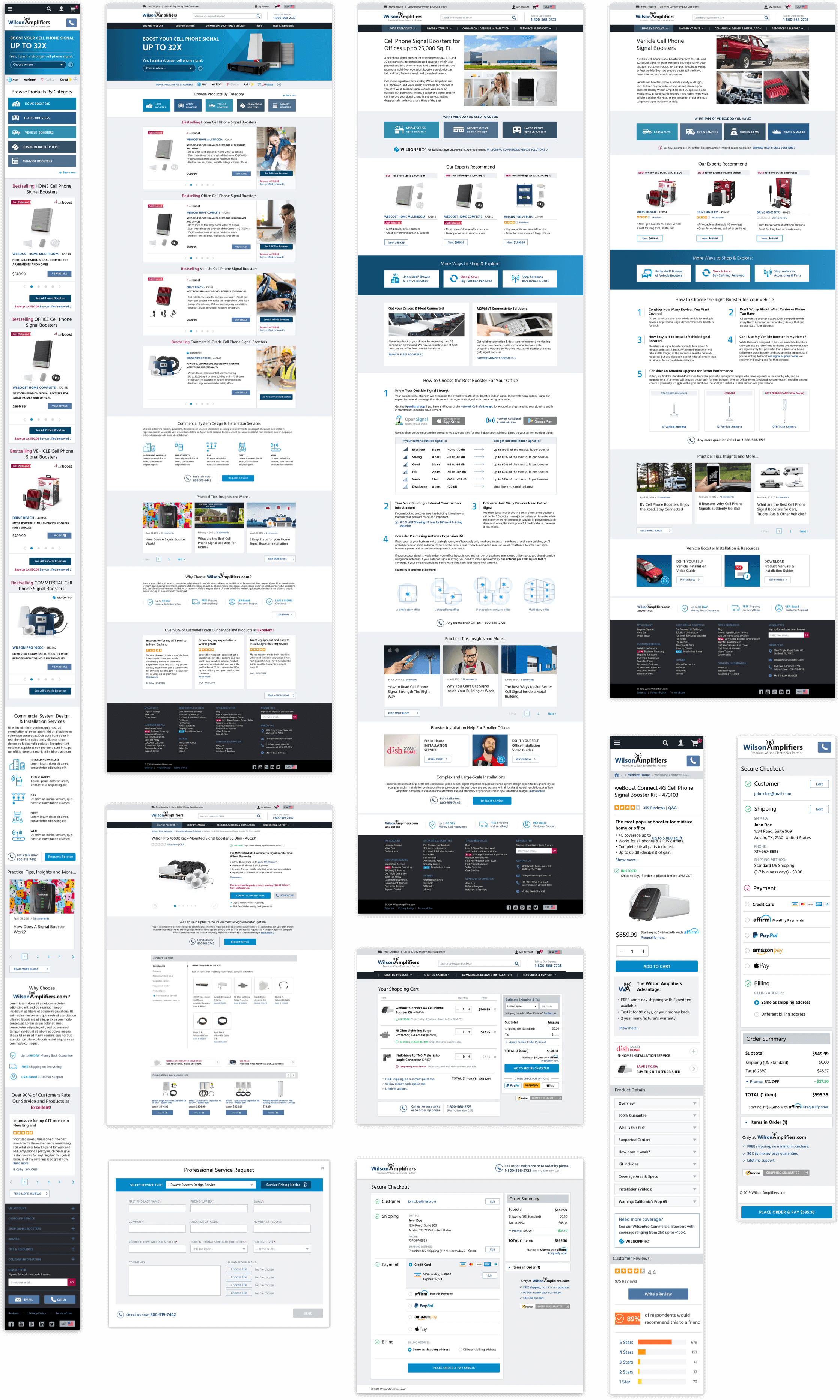
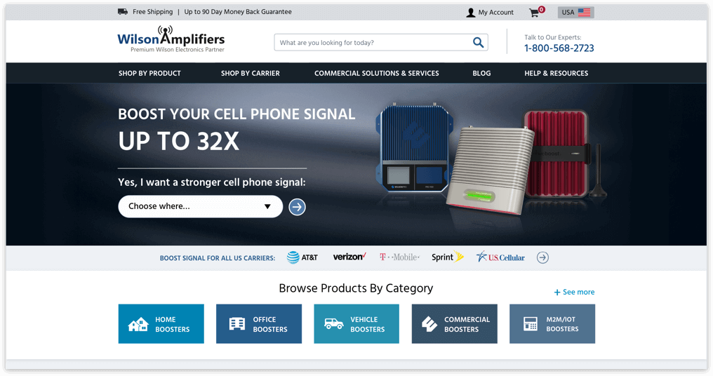
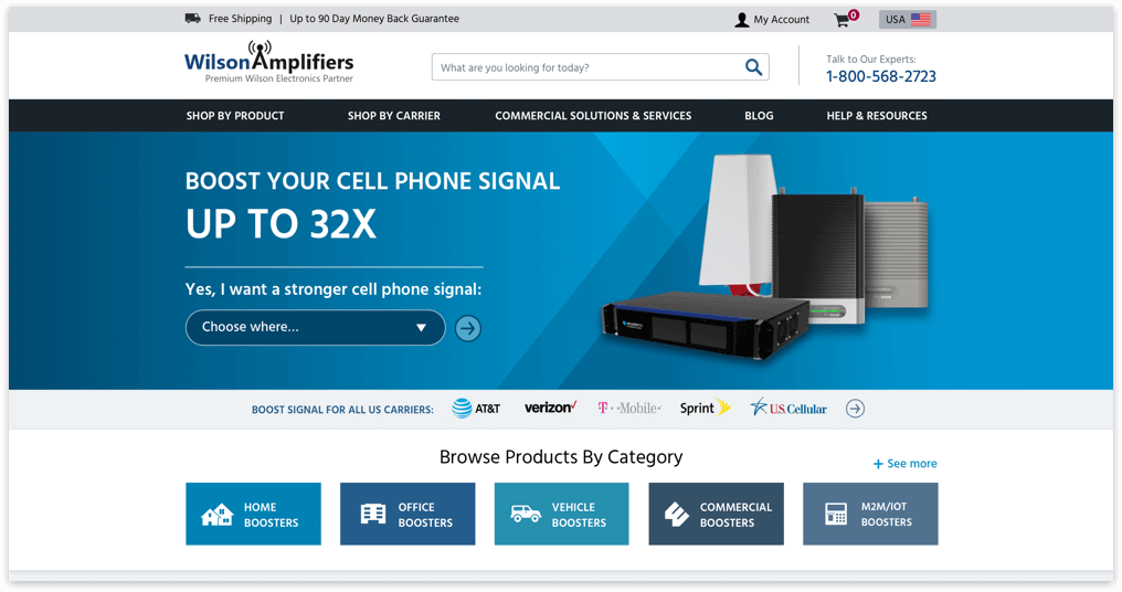
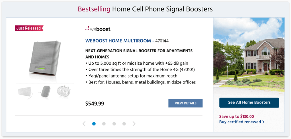
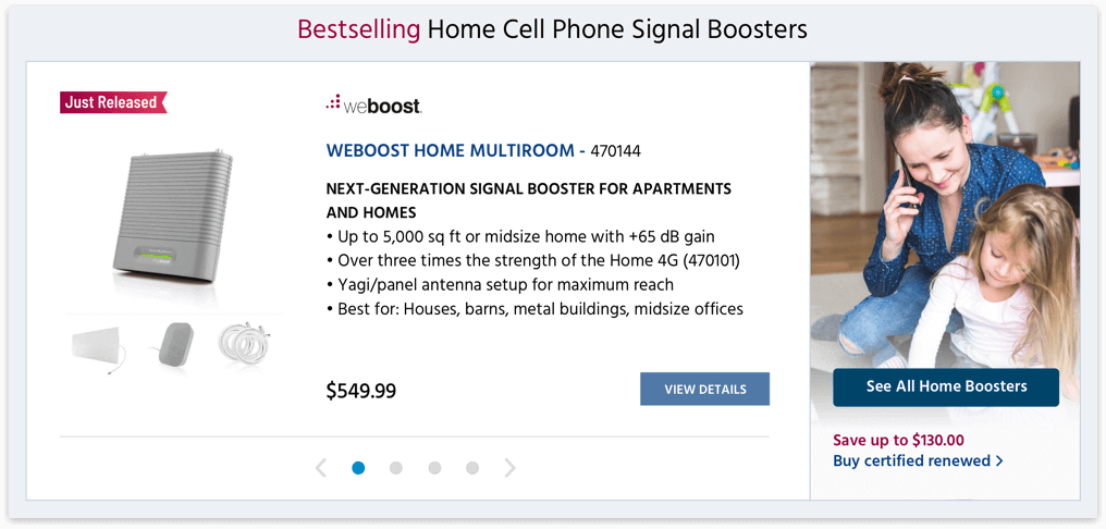
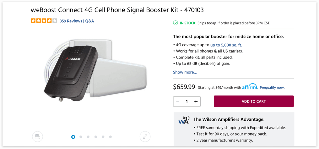
For the site redesign, I proposed to take an iterative approach so we focus on creating the best outcomes, not just project deliverables. We chose to focus on the redesign of the several key site templates and high-value pages: homepage, category page, product details, shopping cart & checkout, and support page.
- Prioritize calls to action based on the importance and profitability of content.
- Remove unnecessary and redundant content. Focus on solutions and product benefits.
- Make the information about free shipping & return policy more prominent.
- Give better product descriptions to help customers make informed buying decisions.
- Improve UX to make the shopping experience seamless, easy, and enjoyable.
- Refine the site navigation and search functionality to facilitate easy access to product categories and information.
- Optimize and improve the checkout process to make it more efficient.
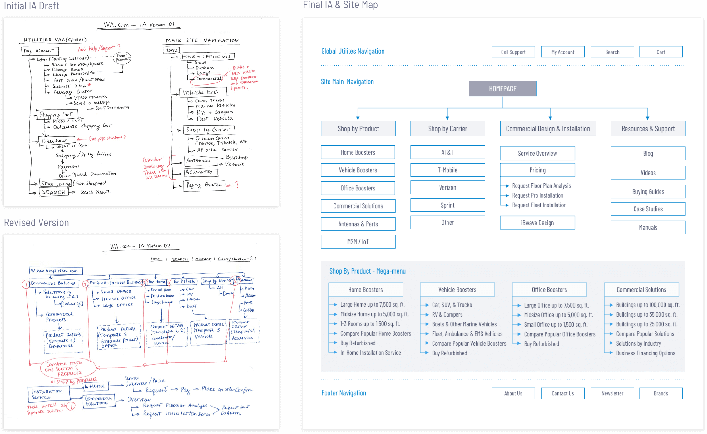
The next step was rethinking and developing a clear and intuitive navigation system. I worked on organizing the site content into logical groups and categories, making sure all components fit together and create a structured and efficient navigational system.
- Simplified the top-level navigation and the site main menu.
- Revised taxonomy for clarity and focus.
- Created dropdown menus for each product category.
- Improved visibility and access to site search, contact, and customer support phone number, and key product categories.
- Visually separated product category menus from transactional and utility menus.
Once the site map was finalized, I started creating wireframes for multiple breakpoints for the key templates and modules: Homepage, Product Category landing page, Product Details page, Shopping Cart & Checkout, and Support Center.
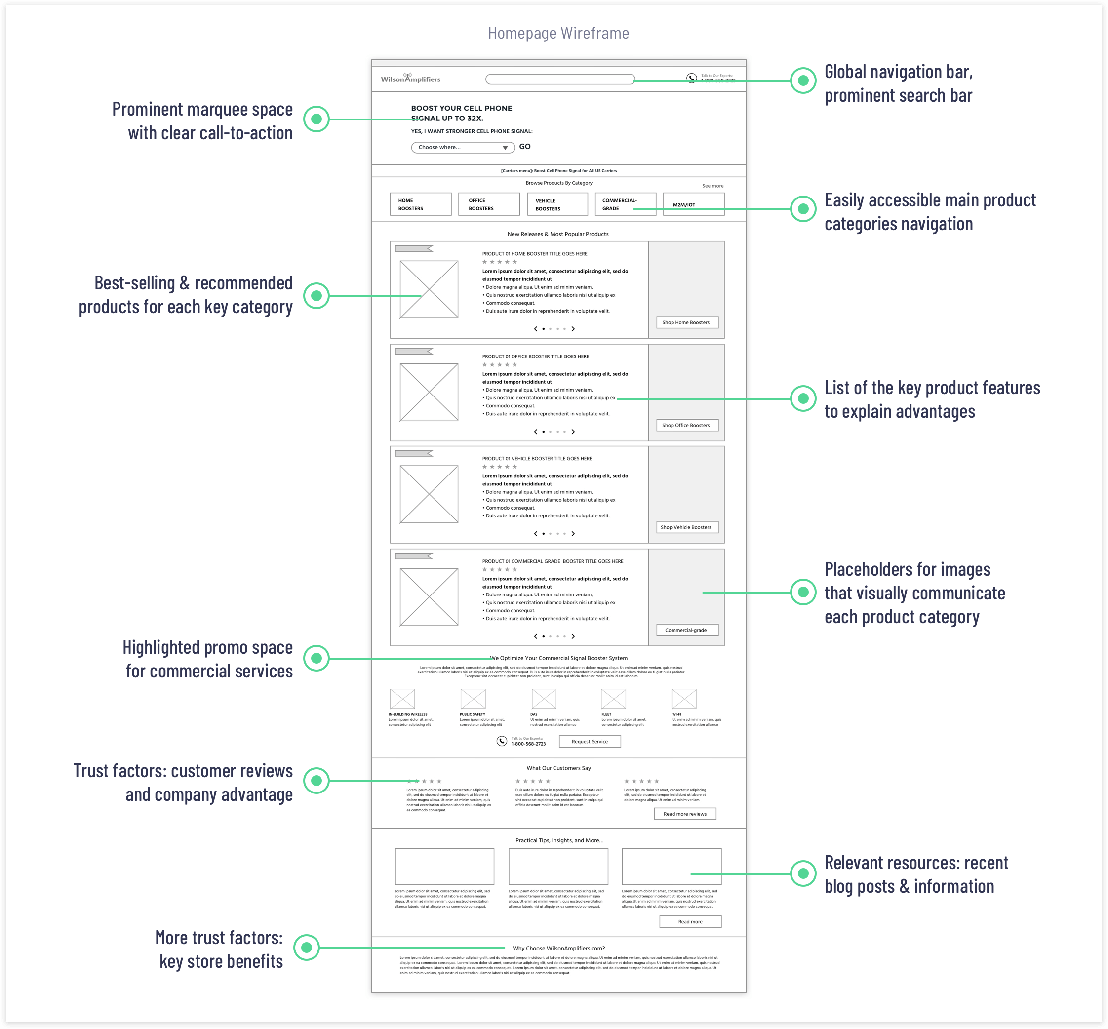
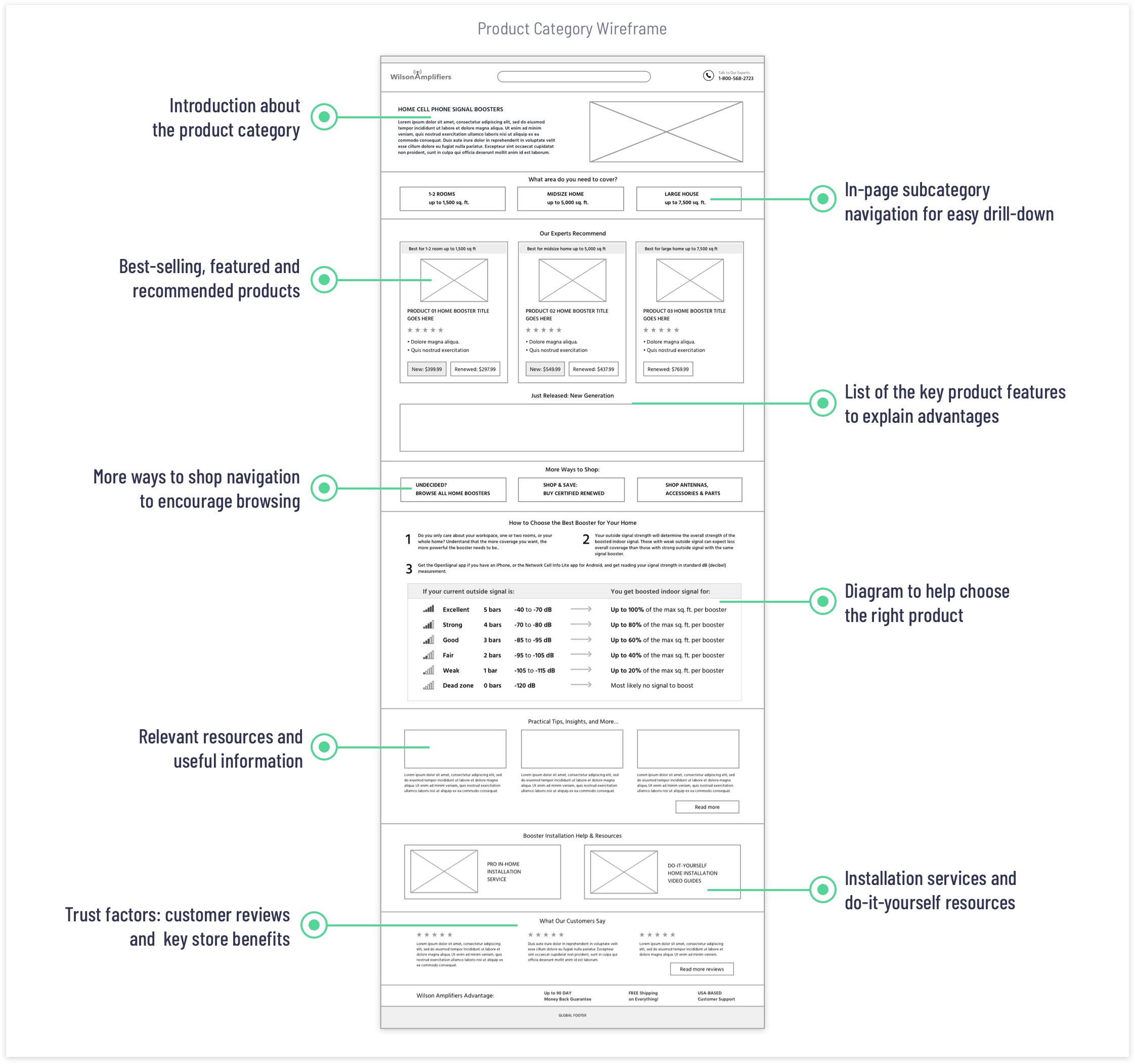
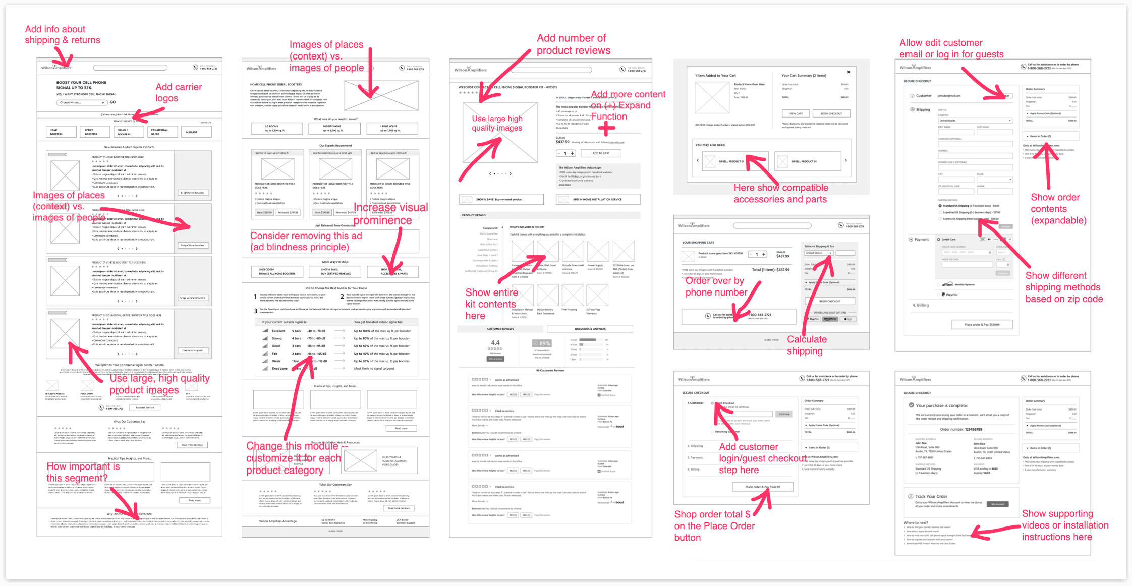
I made desktop and mobile interactive wireframe prototypes using InVision App and ran a usability test at usertesting.com. The results helped me to make sure that users understood the labels & taxonomy. Overall, the user testing revealed that people were able to easily navigate the website and locate products and information they needed to make a purchasing decision.
One of the Wilson Amplifiers’ business objectives was to inspire trust in the business, products, and services. The company wanted to be seen as a trustworthy, dependable and competent solution provider that offers premium products and services.
My first priority was to establish a consistent and memorable brand experience that could resonate with the target audience. The process began with updating the existing logo and color scheme. My intention for the logo redesign was to retain the brand recognition. The revised Wilson Amplifiers logo and brand identity now has a modern visual theme, stronger presence, and conveys quality and dependability.
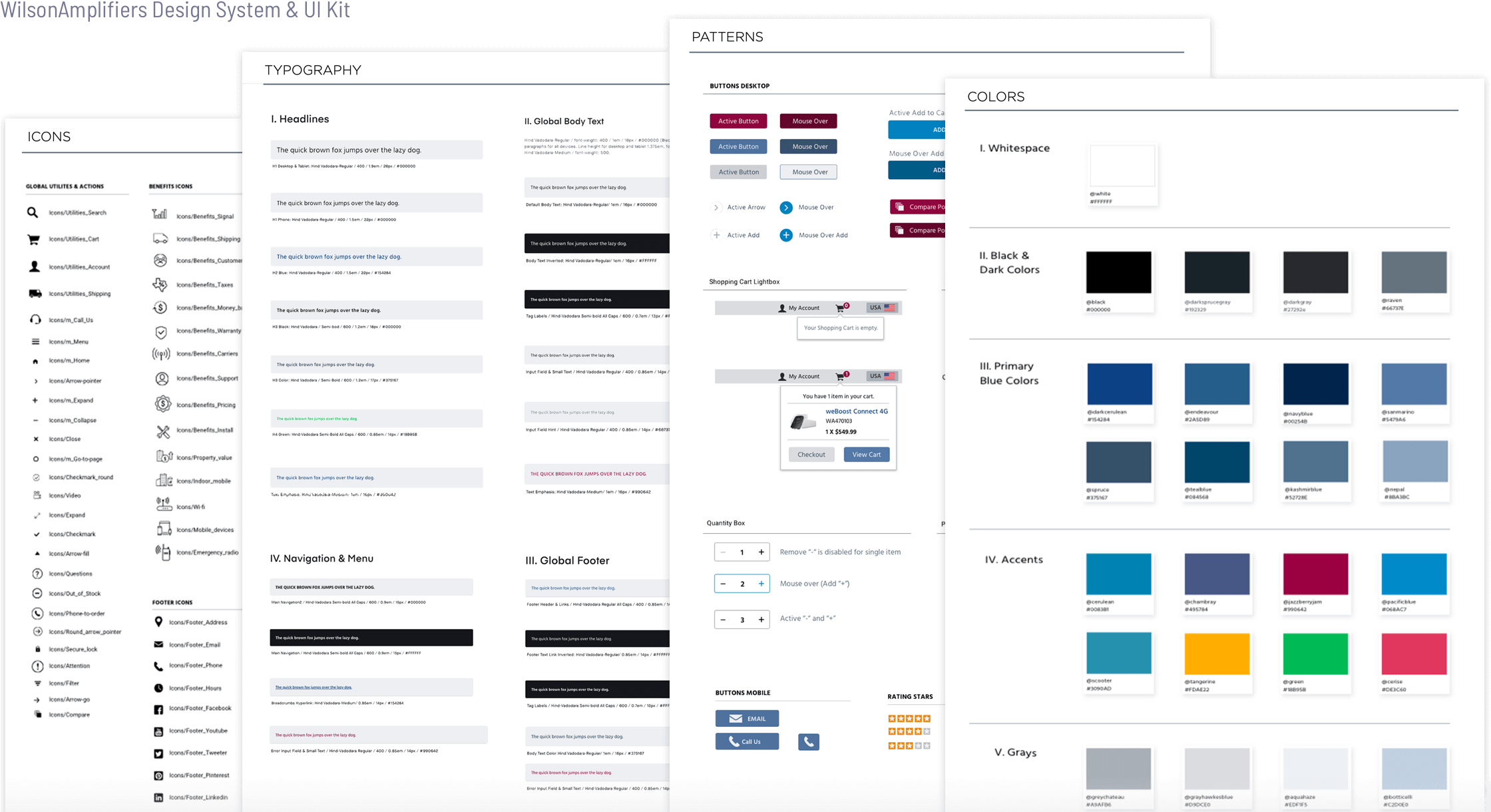
I created several Mood Boards to explore the best fonts, colors, and imagery and presented the Mood Boards to the stakeholders for feedback and approval. To maintain visual and functional brand consistency, I created the UI Kit & Design System that defines colors, fonts, icons that should be used in online, printed, and digital media.
The new site showed significant improvement in performance and user engagement. The redesign efforts to improve customer experience and fortify the brand image really paid off.