Baby Moses Children’s Sanctuary was founded in 2003 by Christo and Lanie. This family provides a loving home and takes care of orphaned children of South Africa. It all started in 2002 when Lanie felt a strong desire to help vulnerable babies and abandoned kids. Christo, who was working in corporate banking at the time, supported his wife’s idea. At first, there was one child at their home. Then another. And then more and more came. Soon they needed to open a second home. Today they look after more than a hundred children at any given time in multiple locations.
I was deeply inspired by this family's truly heroic mission and it was an honor to help them redesign their old brand image and create a new mark and experience that is memorable, positive, and communicates the vision and purpose of this non-profit family-owned company.
I believe that any identity and logo redo should be done with respect to the company’s history, values, and philosophy. Christo and Lanie believe that “every child should grow up with an abundance of LOVE, JOY, HOPE, LIFE''. Their old mark and brand image didn’t quite reflect the company's true identity. It had a feel of a “DIY project”, with gradient colors and a font style that didn’t scale well to different sizes and digital platforms.
- Help the company stand out to boost brand awareness
- Spark interest in potential donors and benefactors
- Create a recognizable or iconic mark that tells a story
- Better communicate the company mission
- Design for use in various sizes and colors
- Create solid branding and a quality, professional image
I was a creative director, brand experience designer, and active contributor to help the company upgrade the old logo mark and define the overall brand experience.
The entire project team consisted of a project manager, a creative director/ identity designer (myself), and a web developer.
I start any logo design project with a design brief questionnaire, conversation with a customer, and research. These activities help me understand the context, see if there are any constraints, and take into account the customer suggestions and desires. After a few initial emails clarifying Christo’s and Lanie’s needs, I started brainstorming the ideas by coming up with words association. It went something like this:
Next, I was ready to start sketching and exploring initial concepts and ideas. I tried to generate and put on paper as many ideas as I could. Below you can see the very early sketches and concepts.
I selected two strong concepts: one was a ‘sleeping baby cradled in a hand’ to represent baby Moses, and the other idea was a ‘tree’ image that symbolized a caring and protective family. I went ahead with designing the logo mark in Adobe Illustrator. I worked in black & white mode to make sure the logo mark would be adaptable and worked well in monochrome and various sizes.
Next, I selected colors and typefaces. I chose colors that are vivid, open, and create a lively, happy, and vibrant mood.
The logo concepts were presented to Christo and Lanie. They loved the ‘Family Tree’ concept and felt that this mark captured their mission and values perfectly. Christo and Lanie wanted to find another typeface that looked more like hand-writing to bring more softness, 'human touch', and organic quality. It was very good feedback and I created several more variations with different typefaces. Below is the final rendition of the logo.
I created a style guide for the approved and finalized logo. The document provided clear instructions to ensure the correct logo usage for optimal visual performance. The guide included the logo specifications, approved logo version in color and monochrome variations, examples of incorrect usage like stretching, altering, incorrect logo placement, etc.
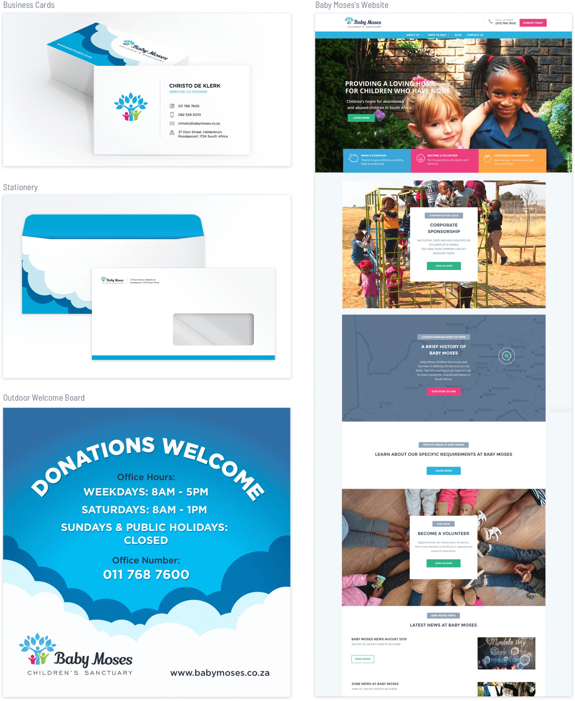
I continued to work on branded items design that included business cards and stationery, social media elements, external signage, and interface design for a website.